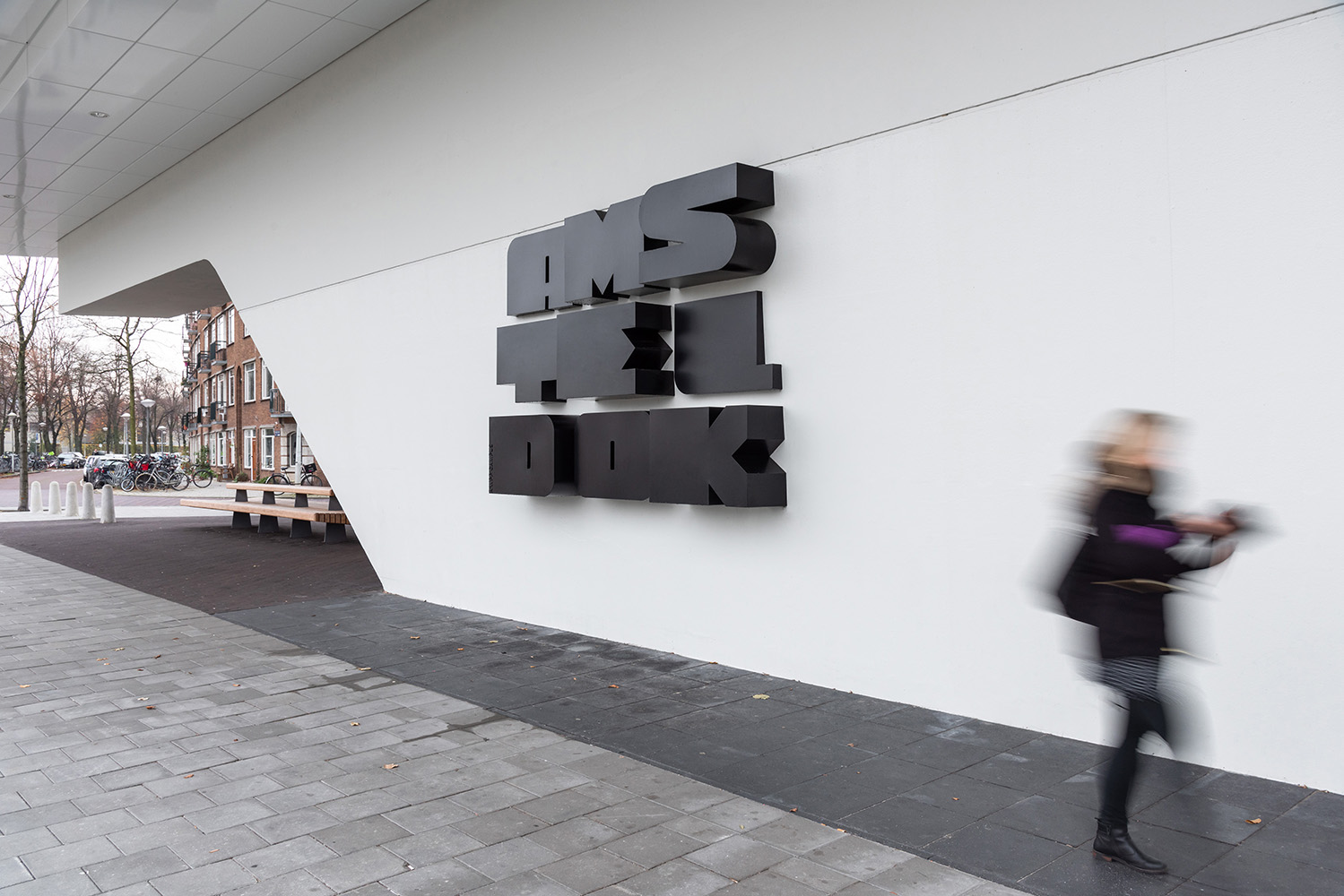
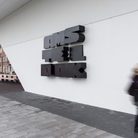


Amsteldok
Photo © VBAT Amsterdam
WPP is a multi-national holding company with a focus on creative communications, media, and advertising. Some of their agencies include well known firms such as AKQA, Grey, and Ogilvy. To encourage collaboration and make it easier for clients to access services from their agencies in Amsterdam, WPP decided to bring together 15 agencies in a single location, creating a campus.
WPP purchased the Rivierstaete building, located on the banks of the Amstel river. Formerly known as the largest office building in Europe, the property had been empty of occupants for some time. The locals had given it the nickname “The Monkey Rock”. While full demolition and starting from scratch might have been easier, WPP saw the potential in reuse and capitalizing on the existing building’s unique character.
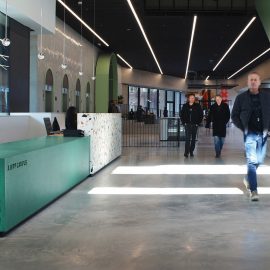
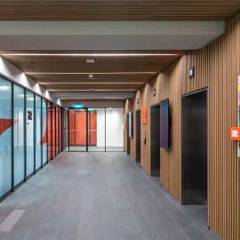
The architecture of the building appears similar to stacked boxes, rising up over the river. BDG architecture + design refurbished the building to function as both a workplace and community hub. With over 2 million sq ft, the campus includes a lounge, rooftop bar, restaurants, and event space.
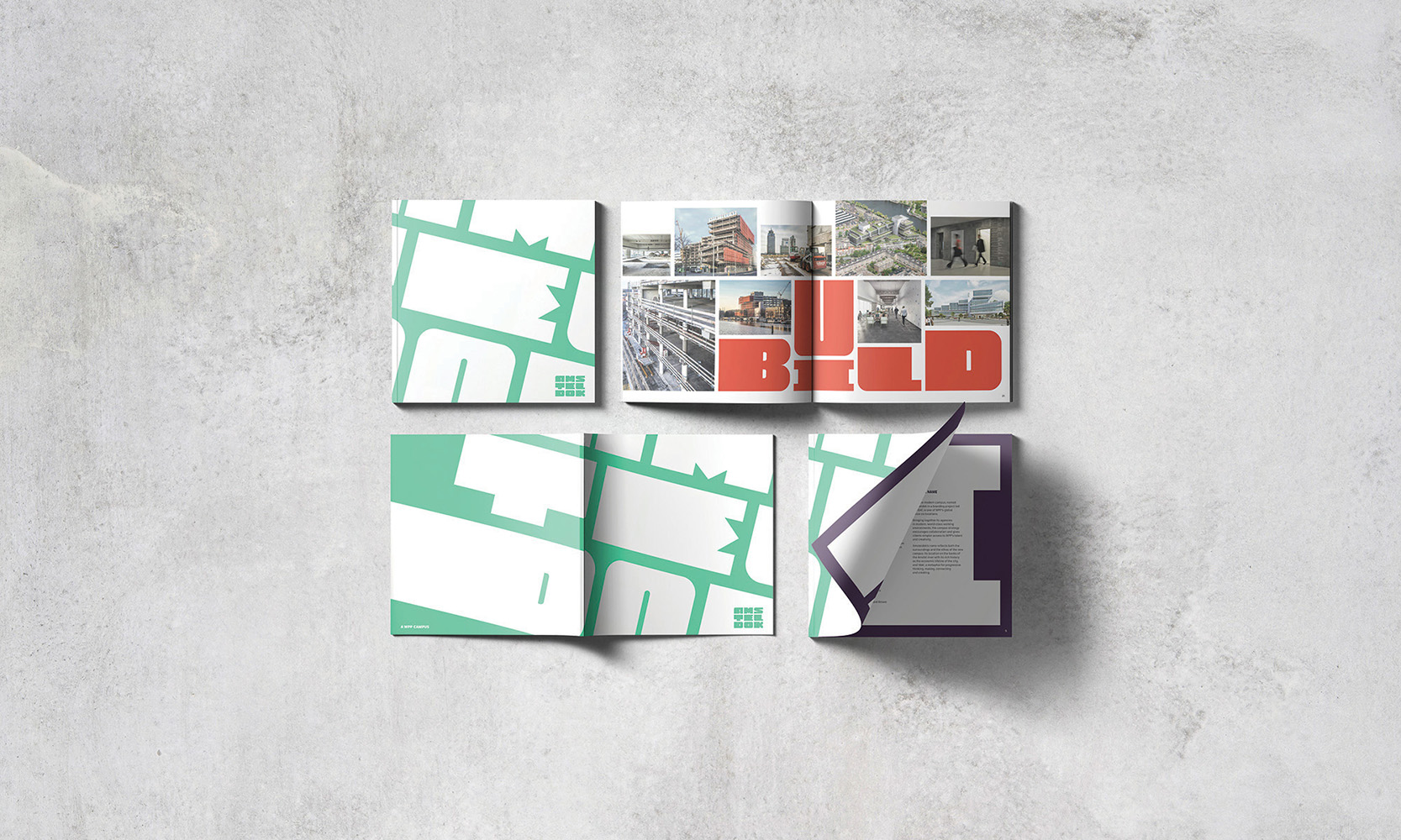
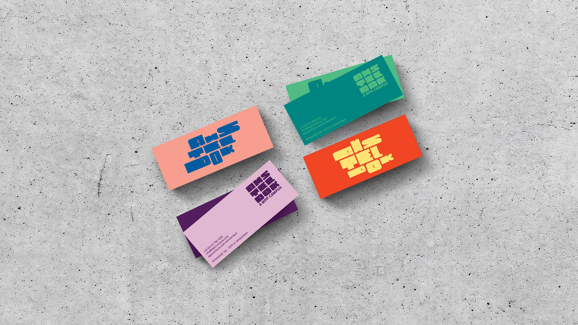
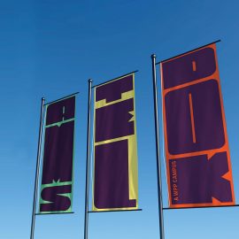
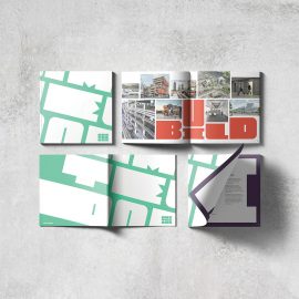
WPP tasked the agency VBAT to develop a name and brand identity for their new Amsterdam campus. The identity needed to reflect the creative essence of WPP’s multiple agencies and help establish the site as a notable landmark in Amsterdam. With the goal of fully integrating the identity into every component of the project, VBAT worked on print and web, custom furniture, interactive installations, wall graphics, and wayfinding elements.
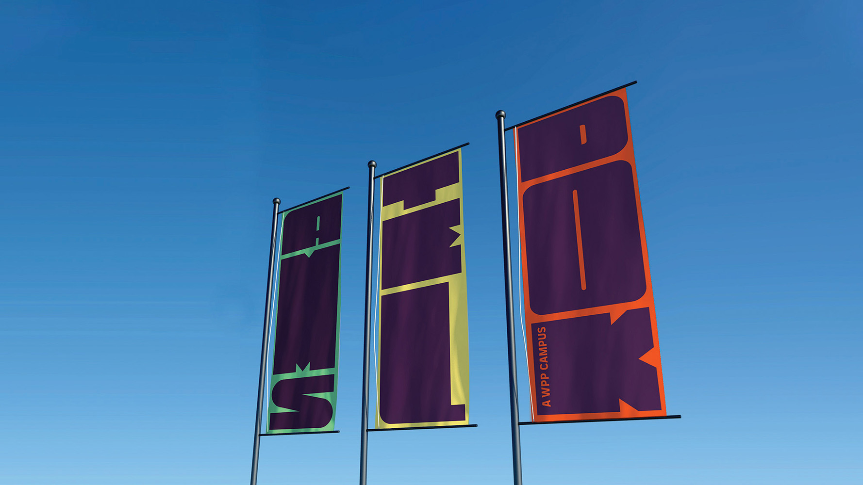
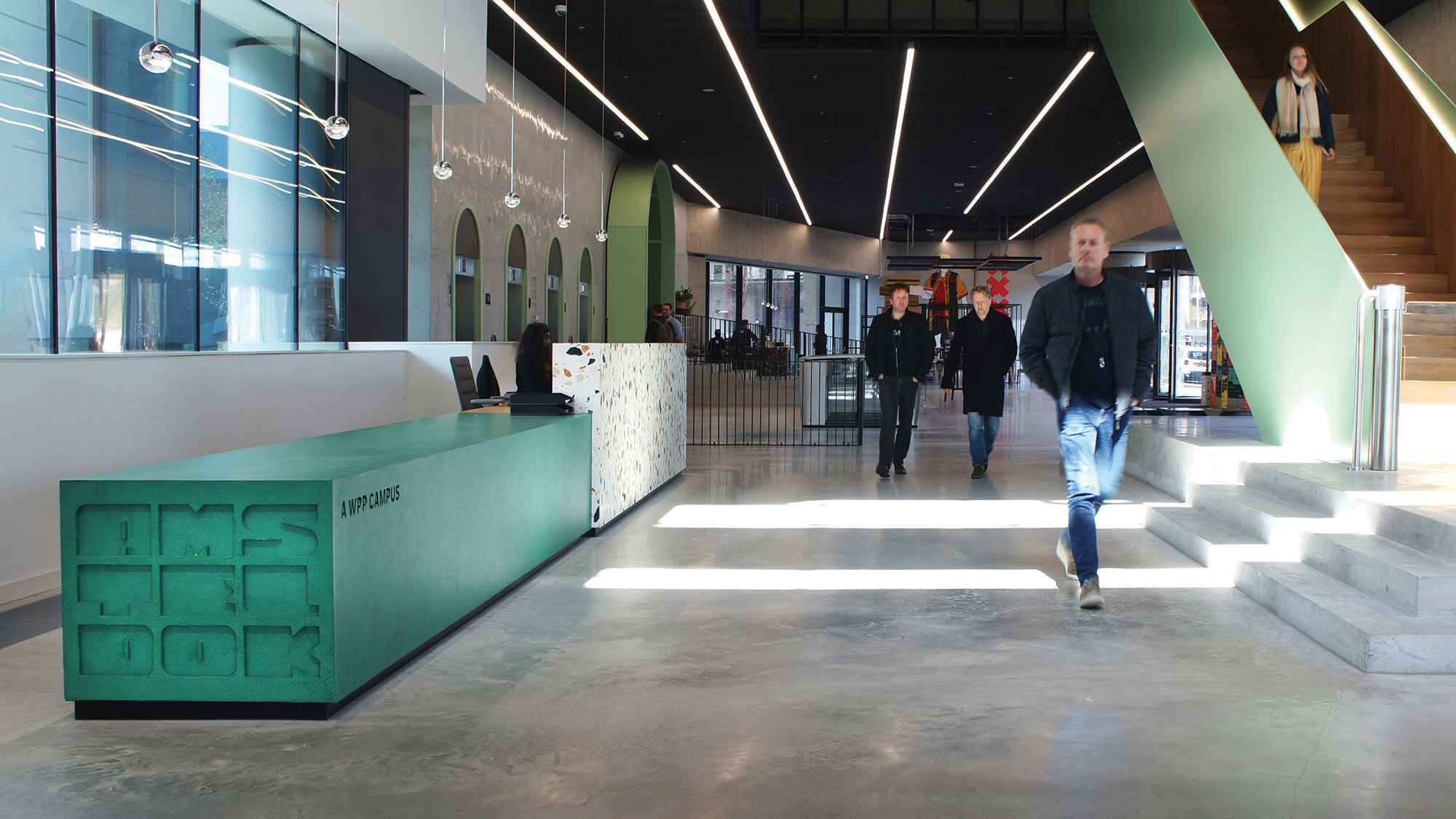
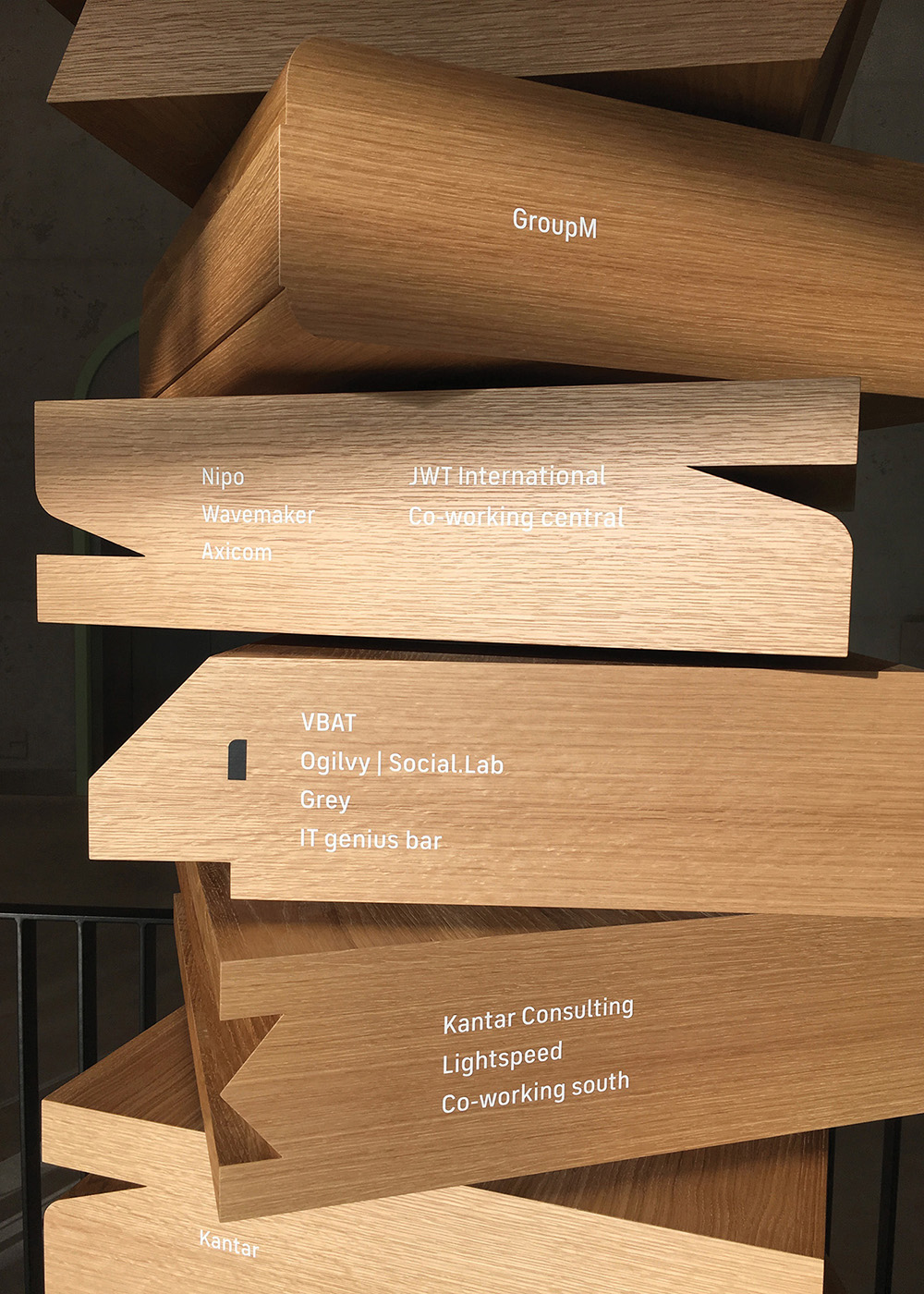
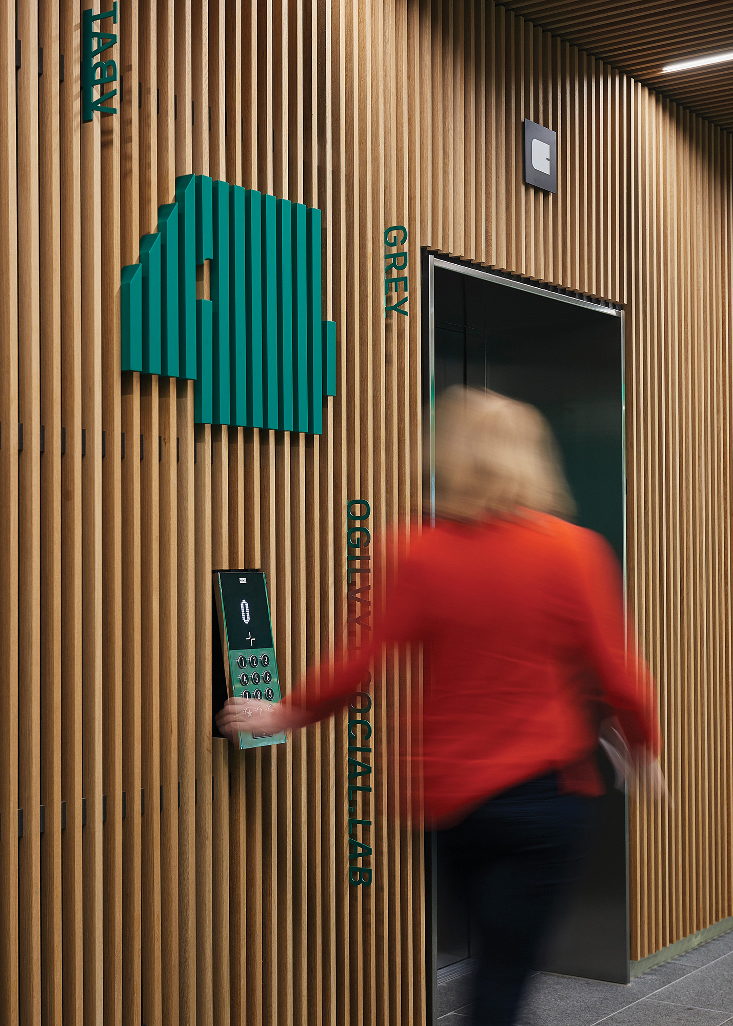
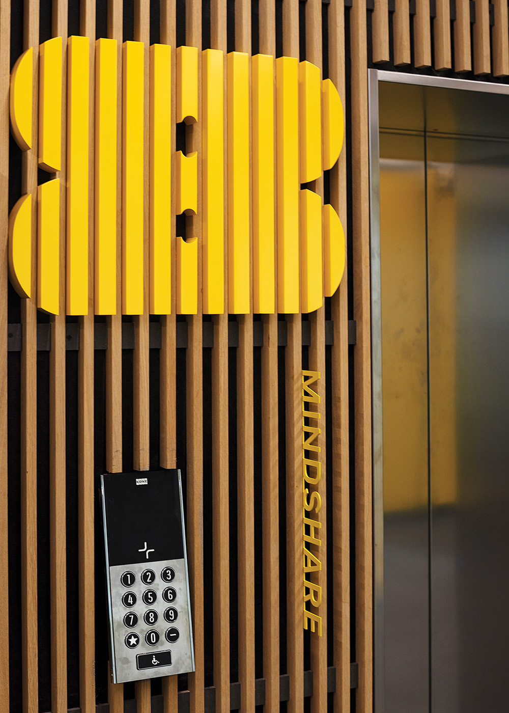
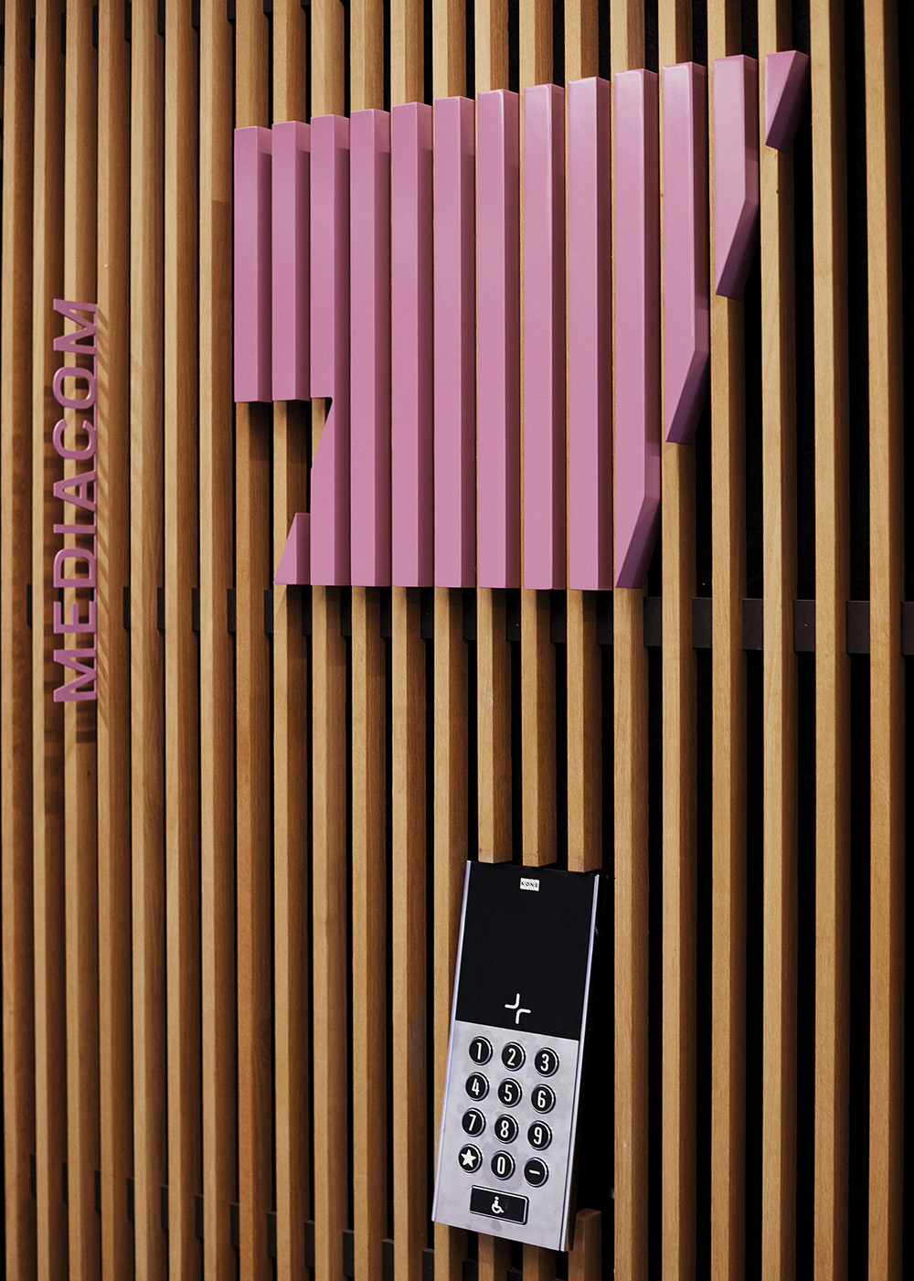
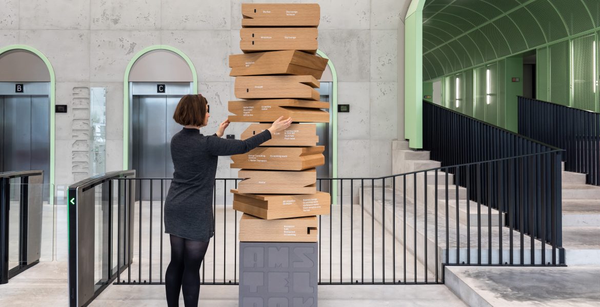
VBAT renamed the building Amsteldok, referencing the Amstel river, Amsterdam’s maritime history, and the city as a gateway to Europe. The designers found inspiration for the logotype shapes in the architectural design of the building. The logotype’s ability to dynamically change shape reflects the overall design strategy for the campus, to create a “breathing space that breaks down walls”. Brand colors were pulled from the architectural materials in the building.
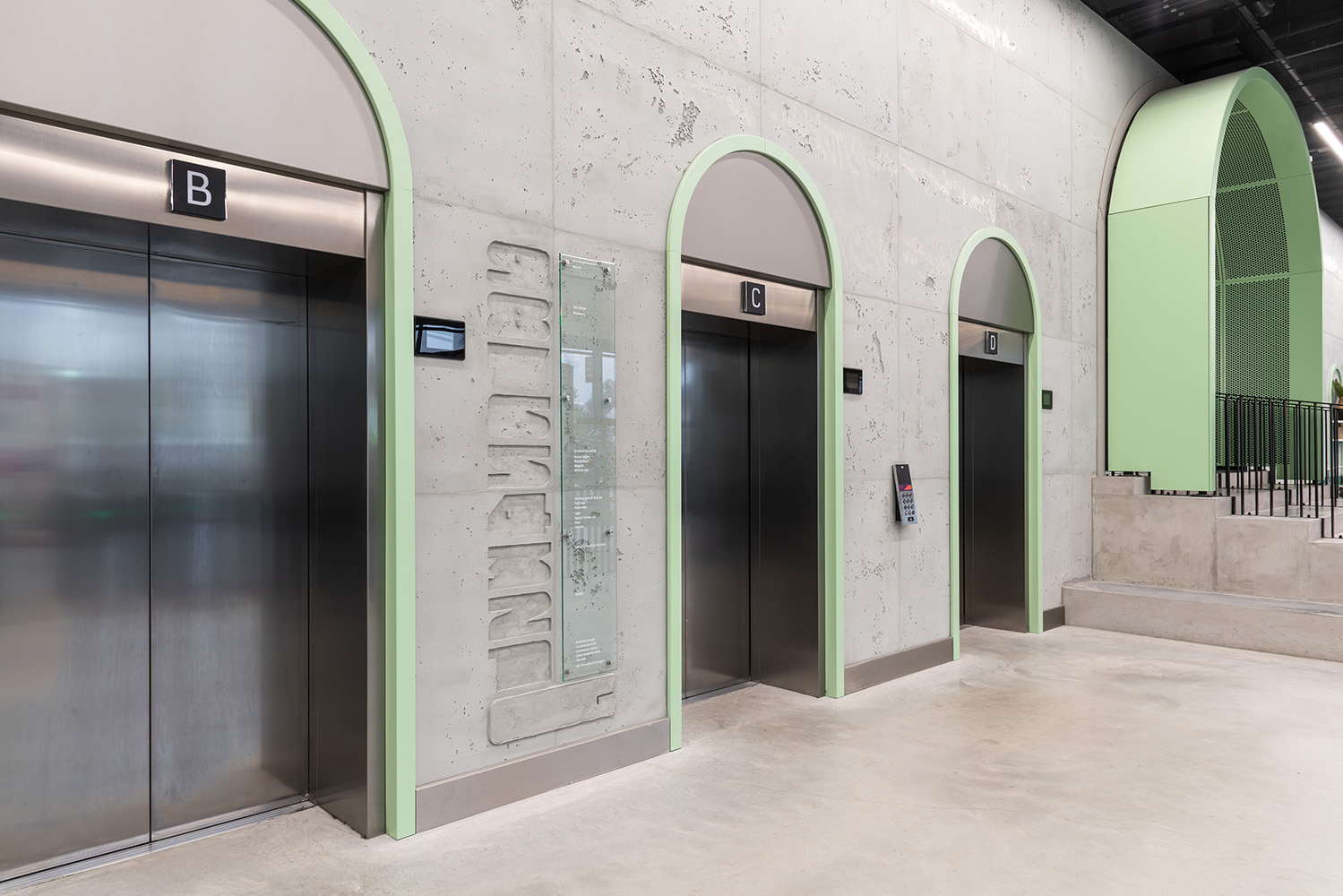
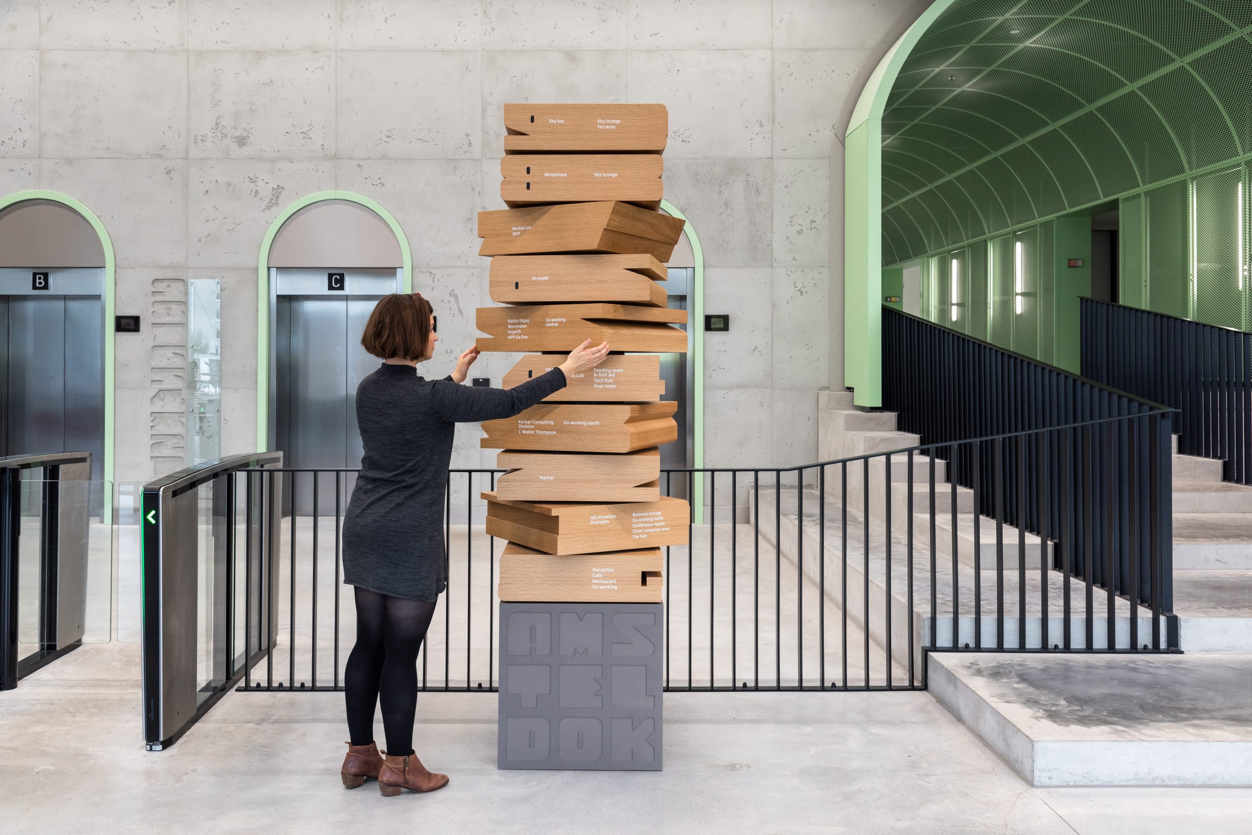
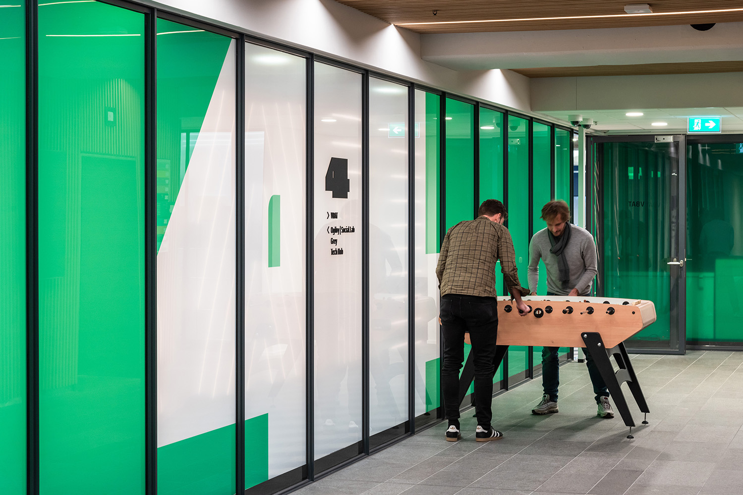
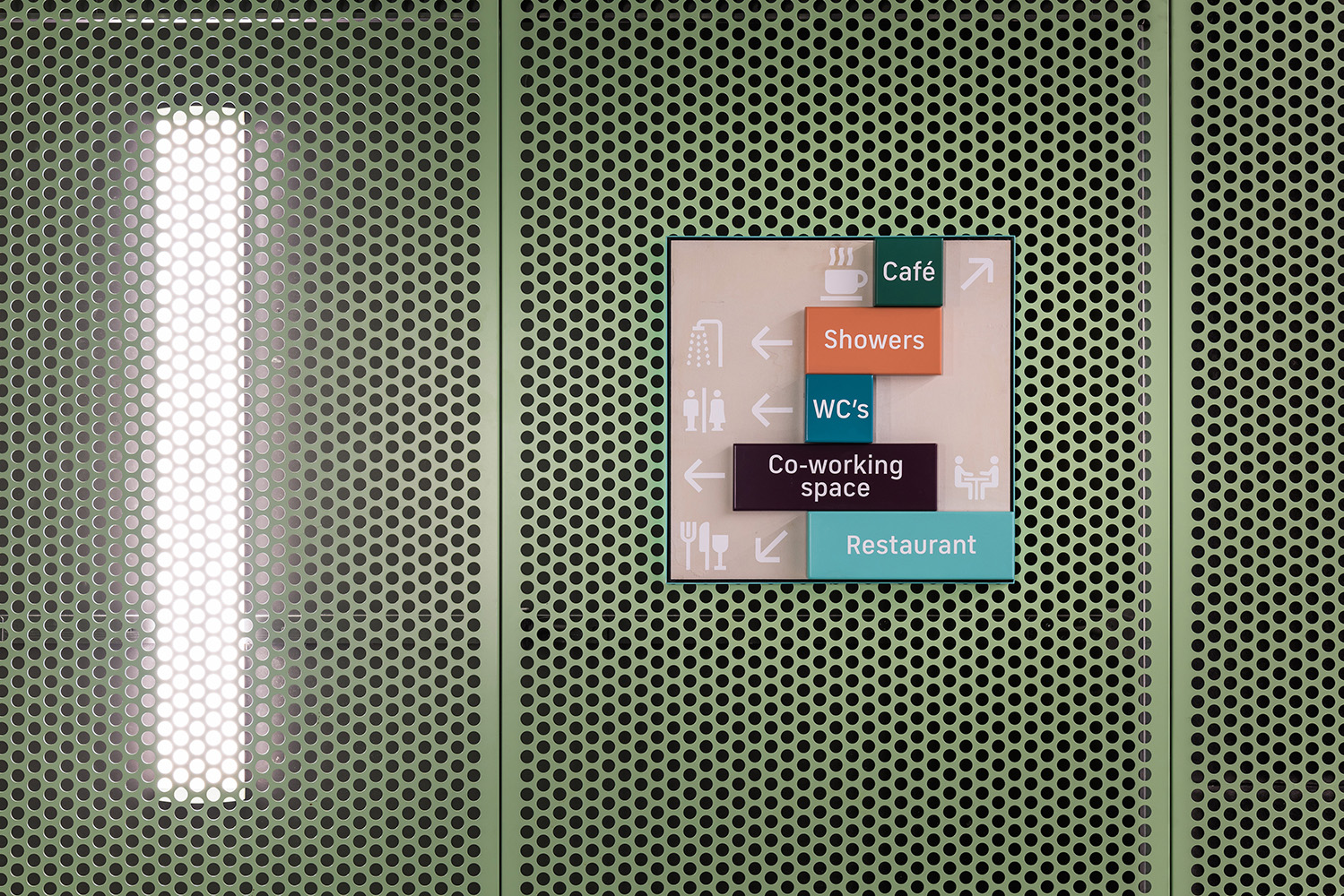
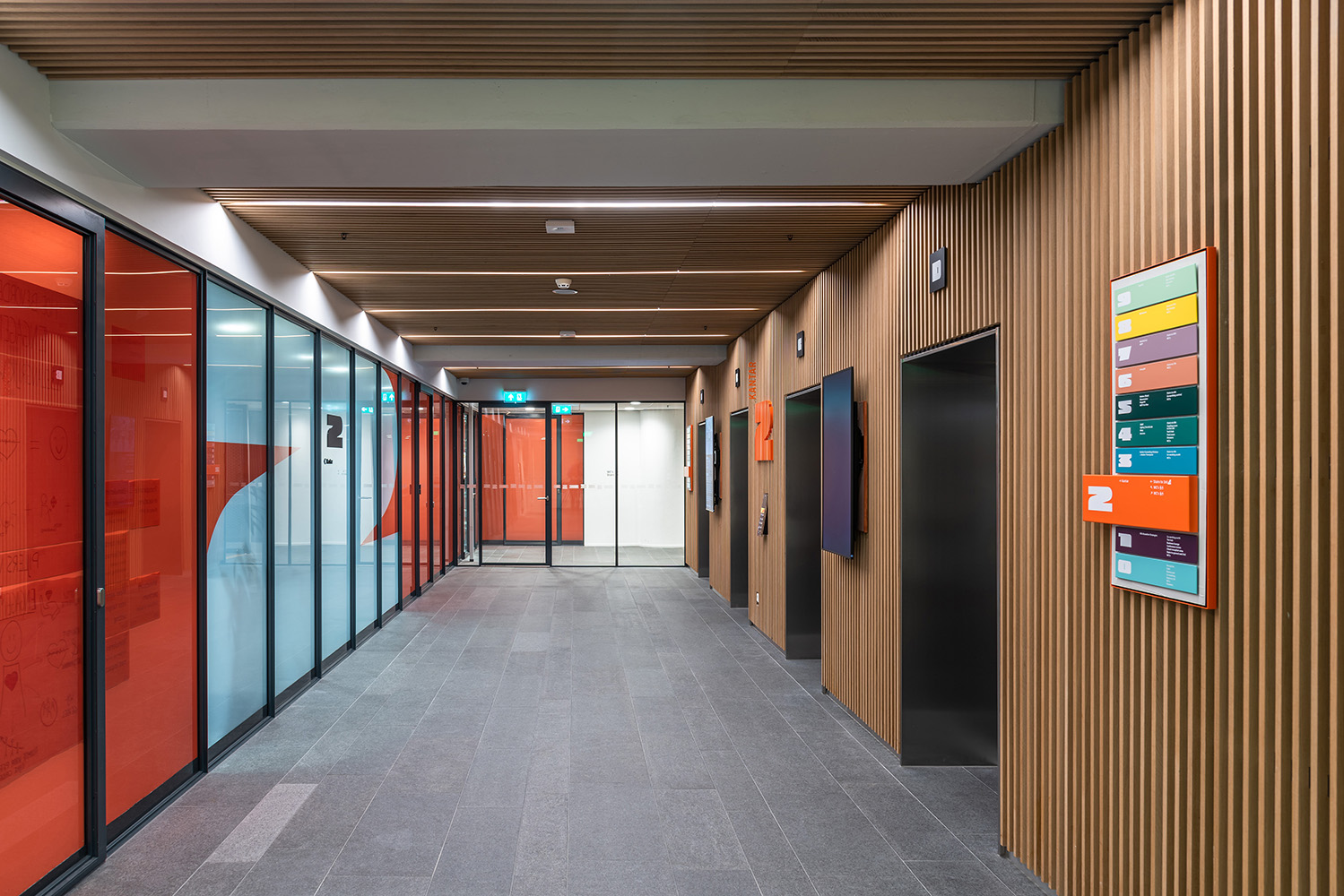
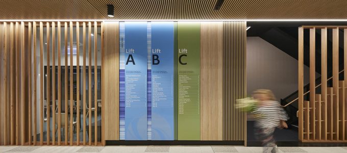
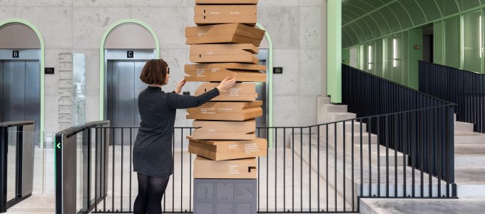
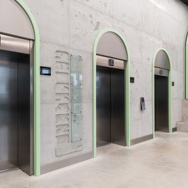
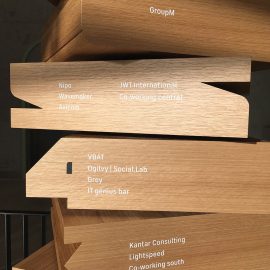
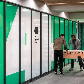
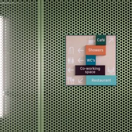
Similar to historic buildings designed in the expressive twentieth century Amsterdam School style, the Amsteldok identity can be found throughout the campus. An interactive floor directory totem, tactile super graphics, directional signs, and furniture such as the lobby desk, all use elements from the Amsteldock identity. Playful wayfinding icons tie into Dutch culture, from bicycle icons to glass icons in the shape of Heineken glasses. All of the design elements contribute to unifying the different agencies, while giving identity and sense of place to the campus.
Moving forward, WPP plans to use the visual identity framework for other campuses around the world.
Project: Amsteldok
Location: Amsterdam, Netherlands
Designer: VBAT
Fabricator: Acrylicize
Architect: BDG architecture + design
Photography: VBAT Amsterdam